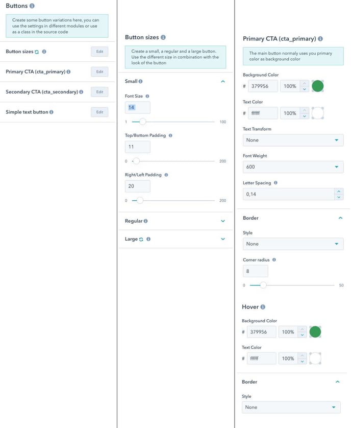
Create some button variations here, you can use the settings in different modules or use as a class in the source code
- Button sizes > Small | Regular | Large
- Primary CTA (cta_primary) > The main button normally uses you primary color as background color
- Secondary CTA (cta_secondary) > Normally this is the inverted version of your primary button
- Simple text button > Converts a standard link to something more fancy
Use the button module and combine size with kind.
is standard href link you can add the code class="cta_primary" or class="cta_secondary" in any Rich text field to create a button.